4 1.4 Magnitude and Frequency of Natural Hazards
Laura J. Brown
Endogenic and Exogenic
Every day somewhere on earth experiences earthquakes, volcanic eruptions, landslides, storms, or floods, and all of these are fueled by energy. Two energy sources generate natural hazards: endogenic (internal) and exogenic (external). The first is endogenic energy generated by the earth’s internal heat, which creates geologic hazards like earthquakes, volcanoes, and tsunamis. The theory of plate tectonics proposes that internal heating from the earth’s core causes large tectonic plates that make up the planet’s continents and oceans and move around like bumper cars, slamming into each other or pulling apart.
Exogenic energy influences weather and climate. Heating from the Sun causes differential heating on the surface, ultimately creating our weather and all the associated hazards. These hazards include flash floods, tornadoes, hurricanes, supercells, and climatic disasters such as droughts and famines.
There is also a relationship between the magnitude of an event (energy released) and its frequency (how often an event occurs).
Magnitude, Frequency and Return Period
The magnitude is the size of an event. It is related to the amount of energy that is released. The more energetic the event, the higher its magnitude and the more likely it is to cause injury, death or damage. Earthquakes, volcanic eruptions, tropical cyclones (hurricanes) and tornadoes all have standardized magnitude scales to assess the size of these events.
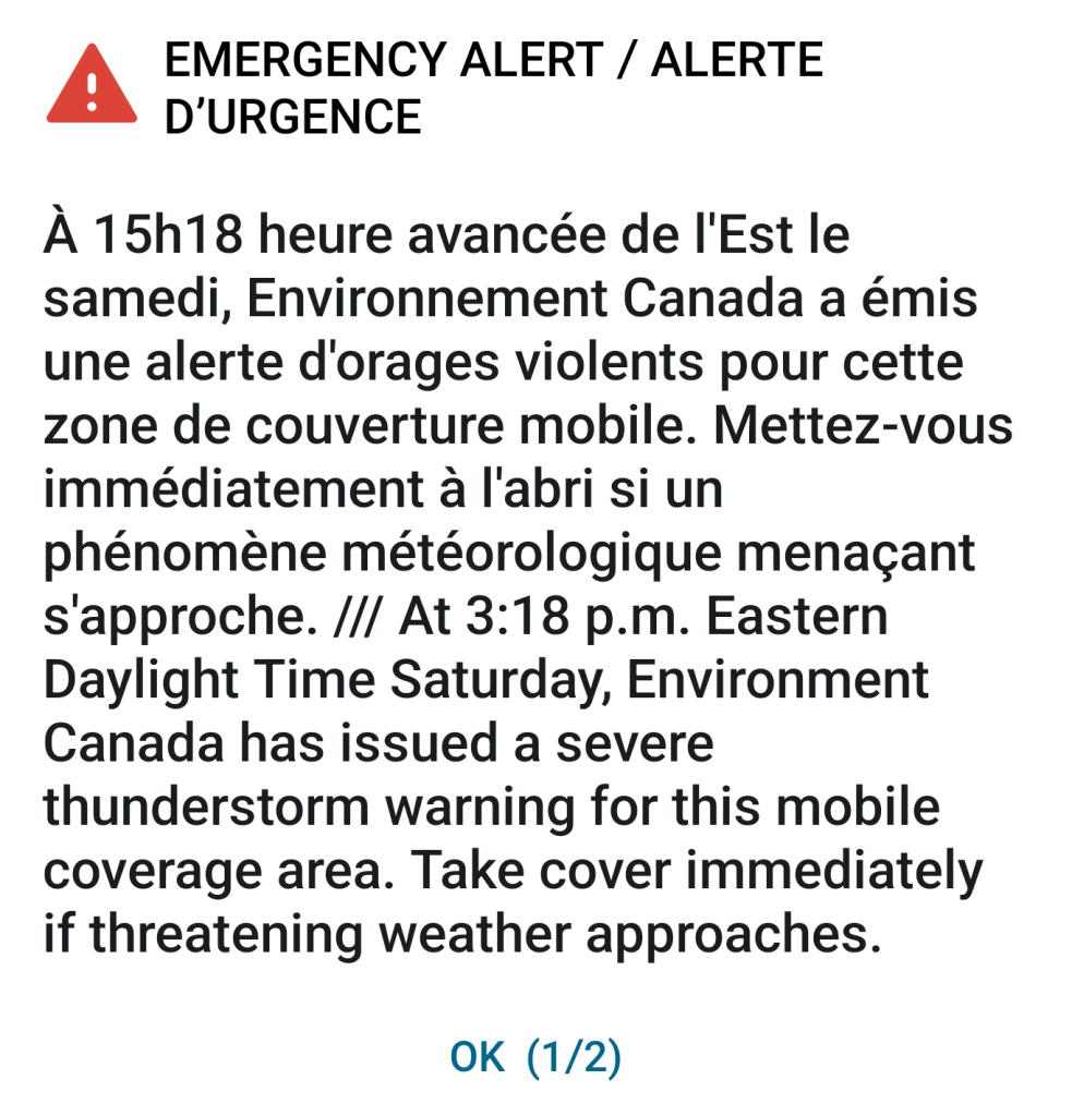
The frequency is how often an event occurs. In general, there is an inverse correlation between frequency and magnitude. In other words, low-magnitude events occur frequently, but high-magnitude events are rare. For example, light winds blow frequently, but straight-line wind storms like the May 21, 2022 derecho are rare. Most weather stations in the storm’s path recorded winds over 100km/hr, with Kitchener, Ontario, recording a peak gust of 132 km/hr. Environment and Climate Change Canada issued an Alert Ready message to mobile phones for the first time (Figure 11).
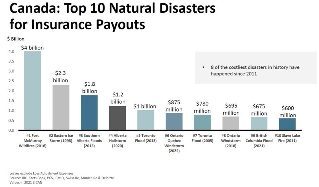
This destructive and deadly storm swept through southern Ontario and parts of Quebec, causing over 875 million dollars and insured damage and killing 11 people. This storm now ranks as the 6th largest in the top ten of Canada’s disasters for insurance payouts (IBC.ca).
Derecho events infrequently occur in Canada; the last time was in 1999.
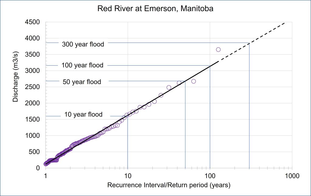
Calculating the return period or recurrence interval is a method used to assess how frequently hazardous events of any magnitude occur in a location. The return period estimates the likelihood of any event occurring in any given year. For example, a 1 in 100-year flood has a 1% probability of occurring in any given year. In other words, it’s very unlikely to happen. Knowing the magnitude, frequency, and return period of a given event in a given area provides valuable information for hazard mitigation planning. Return periods are often calculated for events such as floods, hurricanes, storm surges, earthquakes and tornadoes.
Return period/Recurrence interval methodology
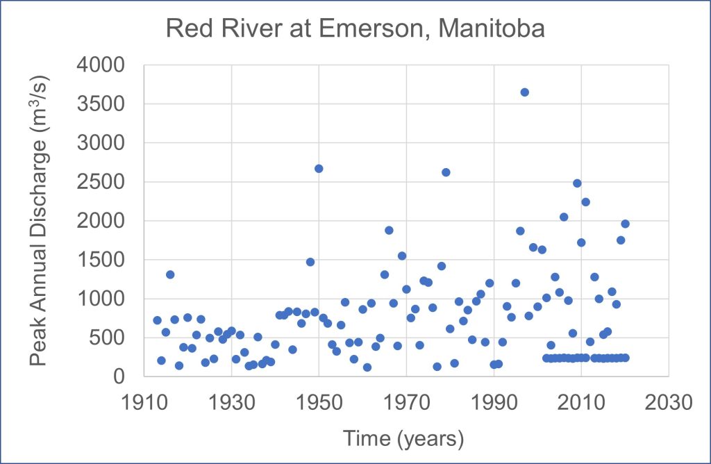
Floods are the most common natural hazards, so we will use blood frequency curves to illustrate the methodology used to calculate the recurrence interval for a particular location. The return period is a statistical measurement typically based on historical data records. In this demonstration, the Red River at Emerson, Manitoba (49°00′25″N 97°12′53″W) on the Canadian side of the border with the United States is used. The annual maximum or peak discharge (m3/s) records are needed for this analysis. We have 126 years of peak discharge data for the Red River at Emerson.
First, sort and rank the discharge data from highest to lowest. Then use the RI equation (see the example below).
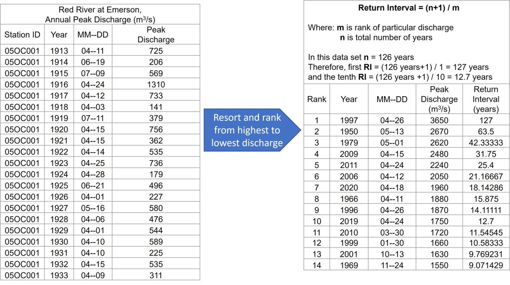
Then plot the flood frequency curve with the Return interval/Return period on the y-axis and the associated discharge on the x-axis.